Whering's rebrand rejects one-size-fits-all style advice
By Team Whering published 09/01/2024

Just like you, our identity is always evolving. That’s why we’re entering a new era, with a new look to go with it. 2024 is our year of radical self expression.
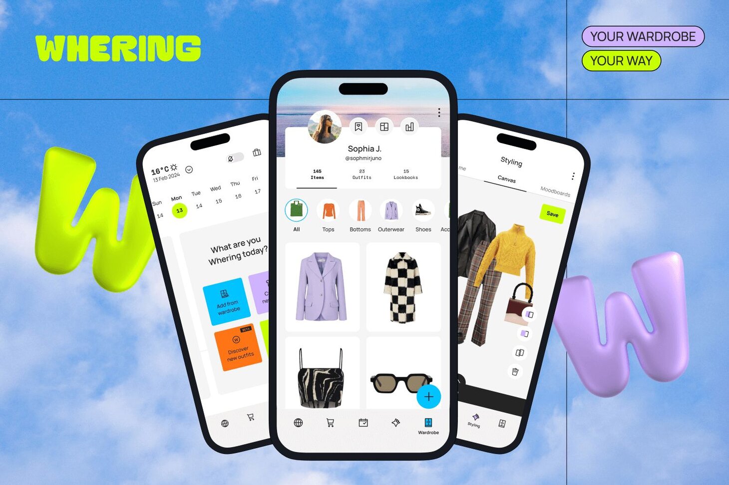
Your wardrobe, your way
Whering is a space where style thrives and sustainability lives. It’s a place where you can experiment with what makes your style personal to you, whilst keeping your clothes in play.
For the last century we’ve been bombarded with generic advice on what to wear and how to wear it- first by magazines, and now by strangers on social media. We’re tired of one size fits all styling advice from people who don’t know us, or our wardrobes.
Our rebrand says no to blanket fashion advice, helping you find freedom in structure. You first need a box in order to think outside it. You need lines on a page to be able to colour outside. You need to be told the rules in order to break them. Structure isn’t the antithesis of freedom, but the catalyst for it.
We believe the maximum potential of our wardrobes is untapped until we add organisation. At Whering, through organisation we’re actively building the framework for your creativity to thrive.
There’s only one rule: wher what makes you feel good.

We’ve gone bolder
To represent our new era, we’ve changed up our look.
Switching from pastels to bold shades of purple, green, blue and orange, we’re celebrating the uniqueness of your style. Brighter colours represent Wherers bold aspirations, shaping a fairer (and funkier) future of fashion by getting the most out of clothes they already own before buying new.
Taking on a new form

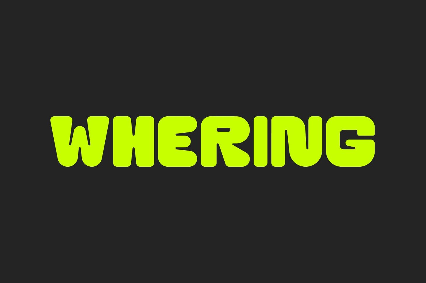
As well as our colour palette, our Design Director, Siân Spicer, created a new logo to show the ‘fusion between playfulness and precision’ on Whering.
The squared letters shape the foundation of the characters that seamlessly transition into rounded corners, representing the contrast of organisation and play that’s essential to Whering.
As well as a new logo, we wanted to create a stand alone symbol representing the versatility of style, whilst acknowledging the recognisable aspects of everyone’s unique taste.
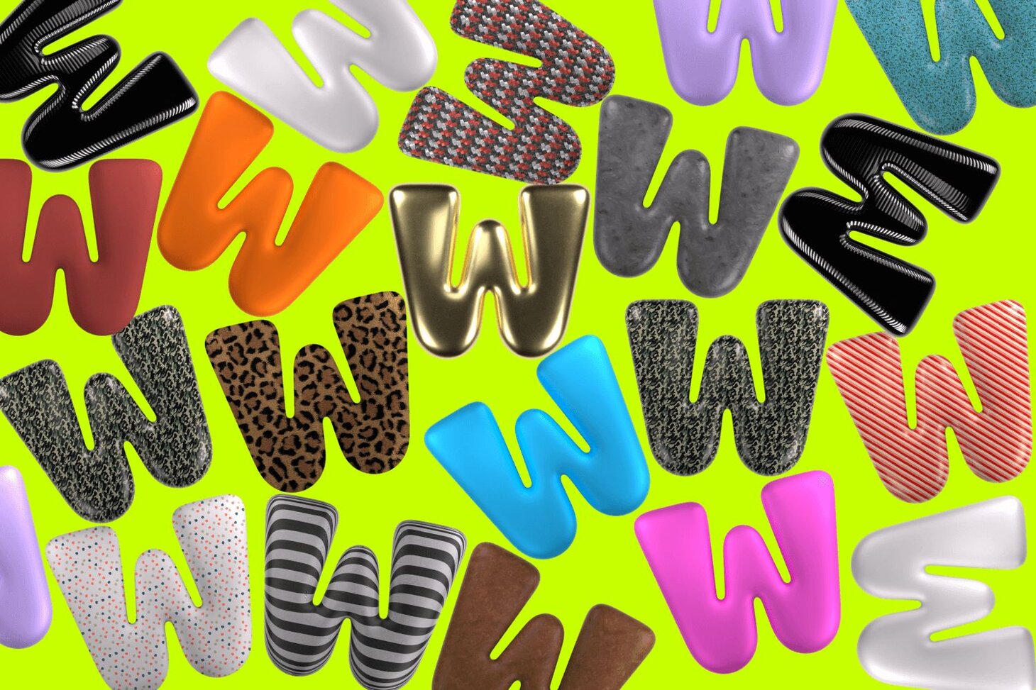
Sian created a ‘W’ letterform, ‘Born from our logo, inspired by our unique proposition our W mark breaks free from the full logo to express the diverse and adaptable nature of personal style.
Representing the possibilities of our wardrobes, our dynamic ‘W’ can wear different colours, fabrics, and patterns, just like us. Symbolising the ever-evolving journey of our fashion sense, a visual reminder that personal style is boundless, and every outfit is a canvas for self-expression.’
See for yourself
We’ve told you all there is to know, now it’s time to explore Whering for yourself.
Something on your mind?
Share your thoughts with Whering community.
If you have an idea for an article around fashion, culture, environment, news, wellness, shopping or DIY, submit a pitch to us!